2018
Brand Refresh
Barwon Water
Challenges
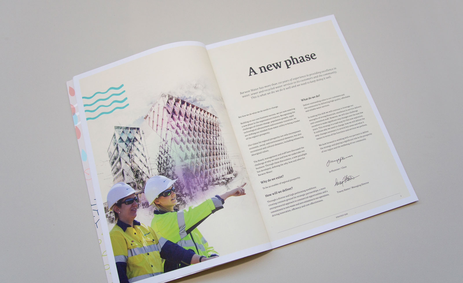
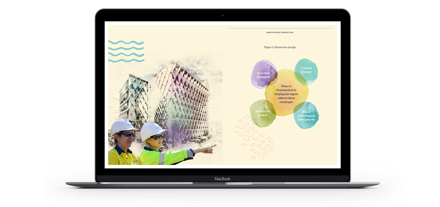
Grindstone collaborated with Barwon Water in 2017 to design its 2030 Strategy. Heralding a significant paradigm shift for the organisation, the strategy outlined Barwon Water’s change from a focus on what it does, to how it does it.
This internal strategy document was the precursor to a full brand strategy – one designed to create a customer facing expression of why Barwon Water exists – beyond being simply a water provider.
Strategy
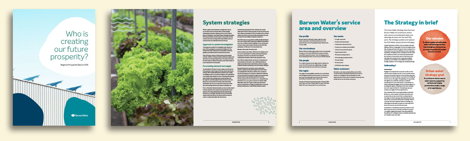
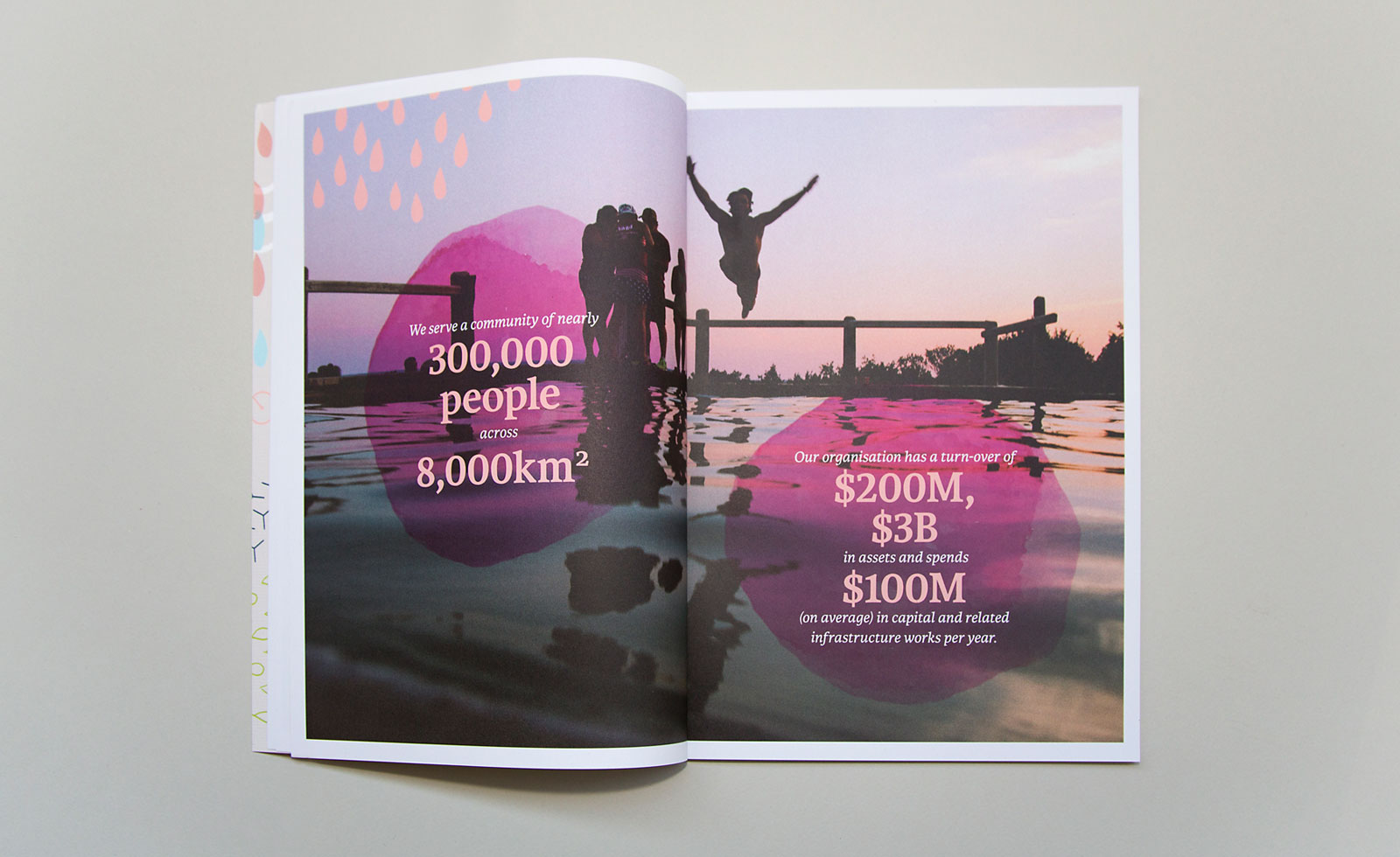
The brand strategy for Barwon Water charted the course the organisation would take to change from being perceived as just a service provider to an organisation that cares deeply about the future of the region and is actively contributing to its prosperity.
Outcomes
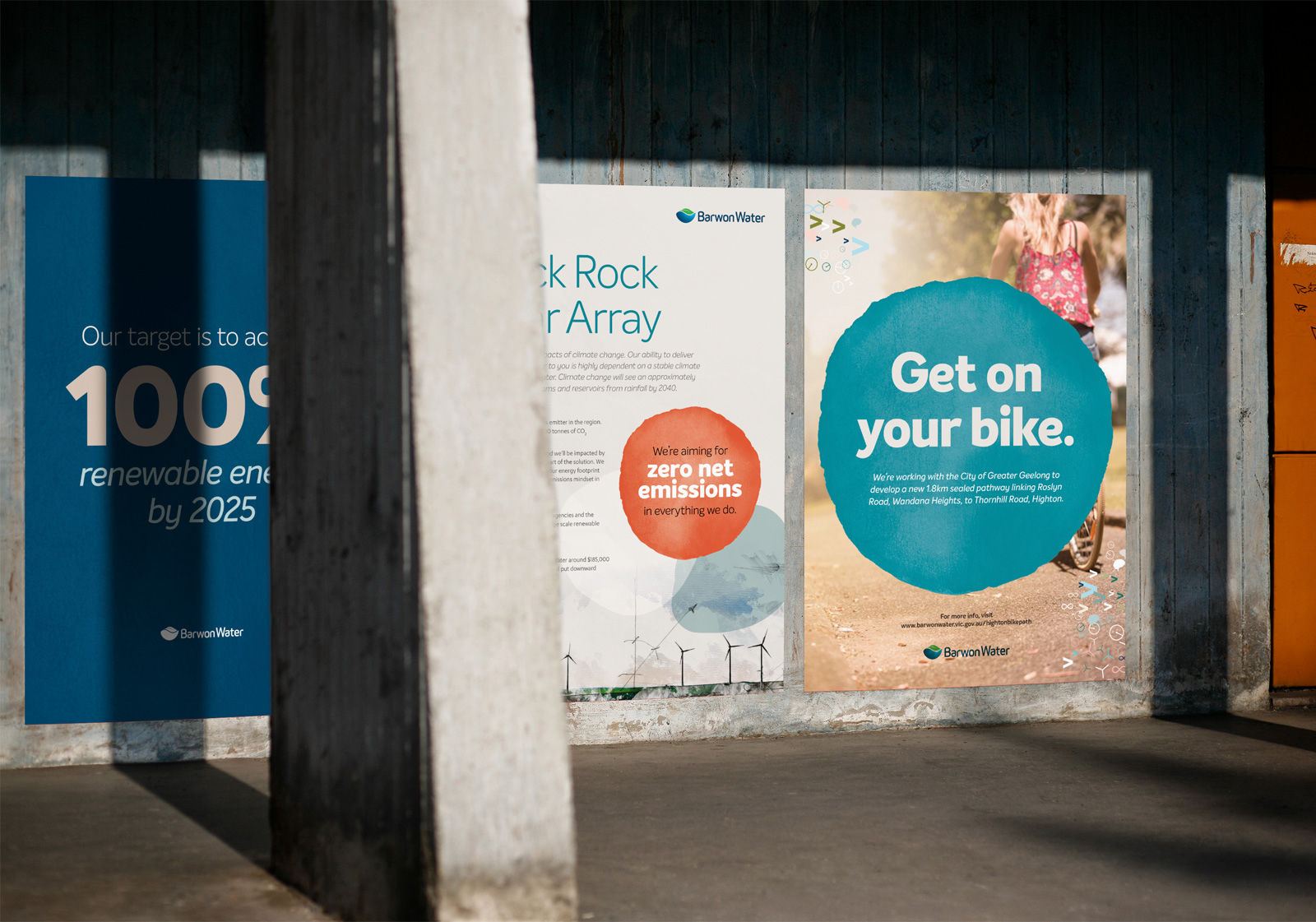
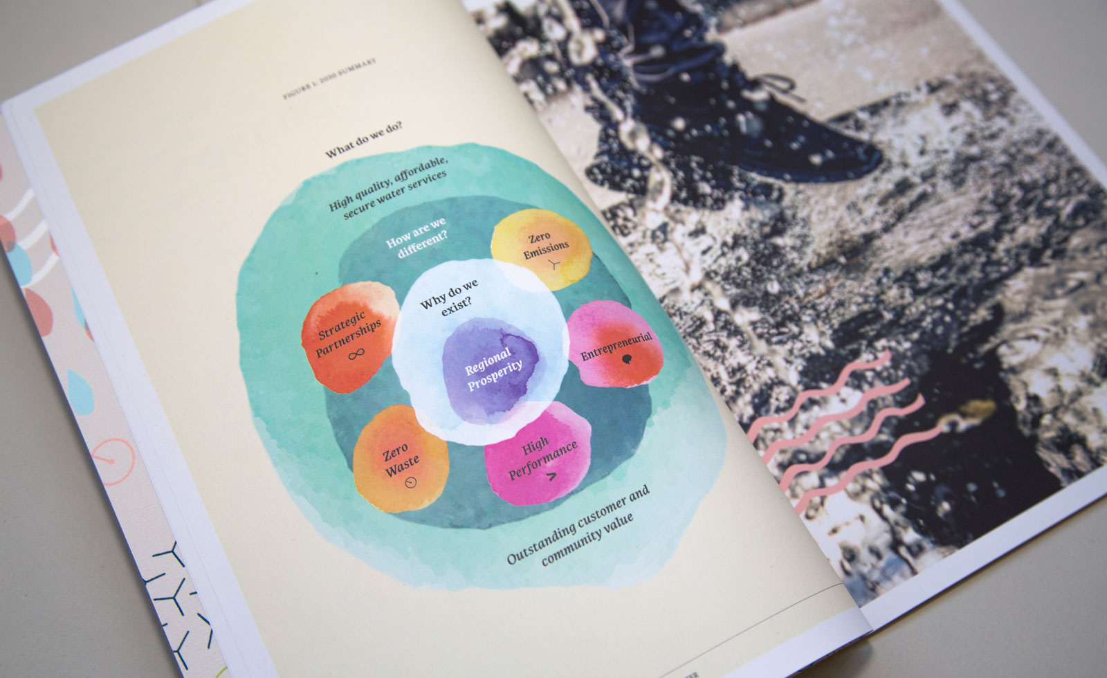
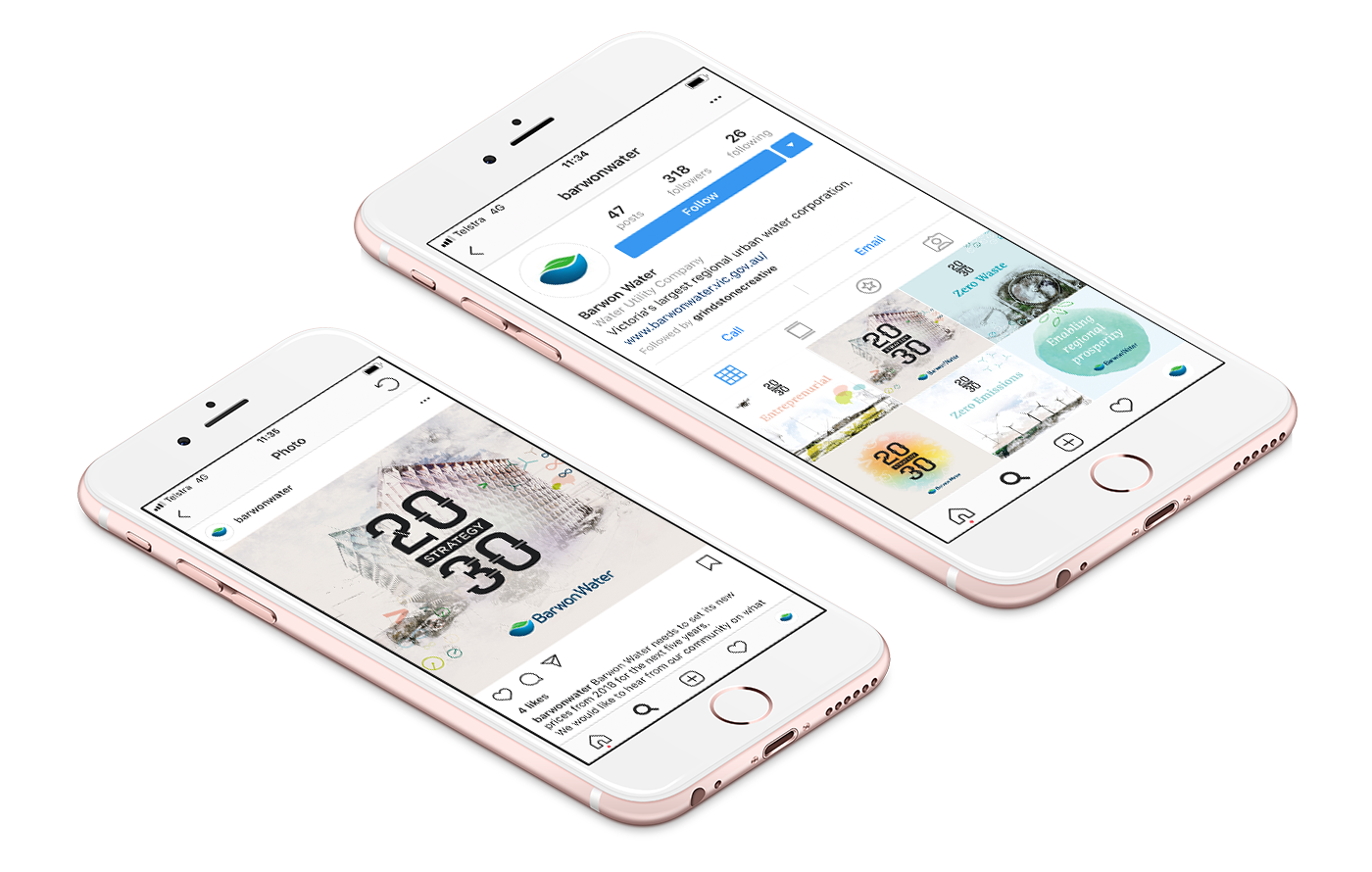
Three ‘golden threads’ were chosen to run through all Barwon Water’s future communications to bring the brand strategy to life. First, ‘More than’ – more than what is expected, innovative, inspiring, always adding value to people’s lives. Second, ‘Working with’ – listening, partnering and creating together. Third, ‘Flow on’ – everything done has a flow on effect that supports customers and community.
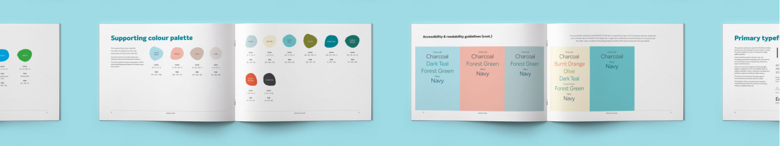
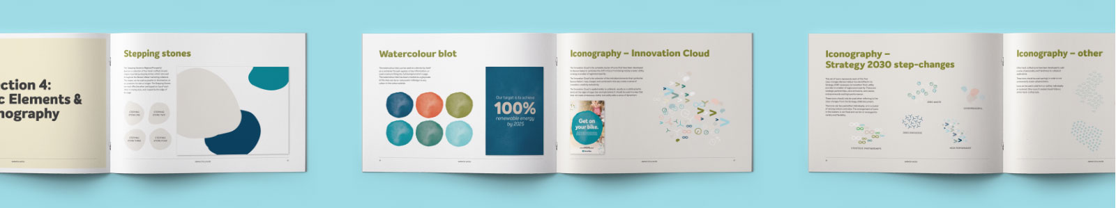
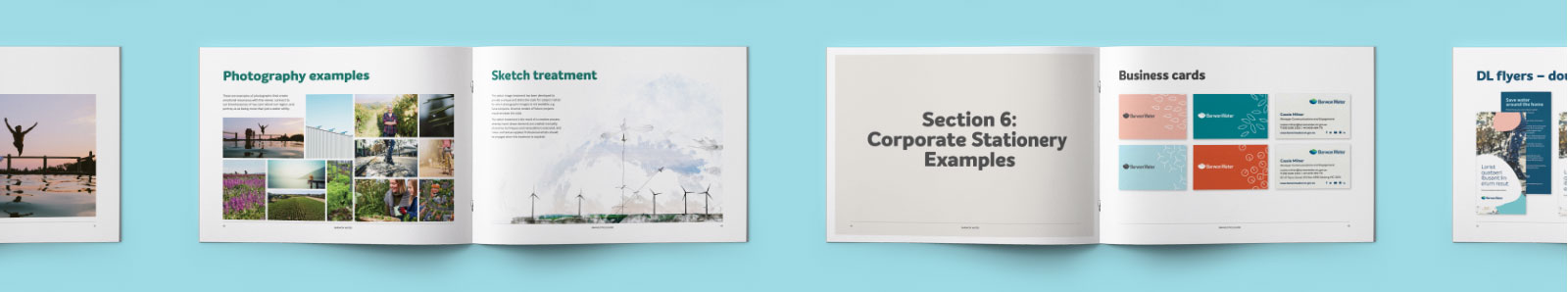
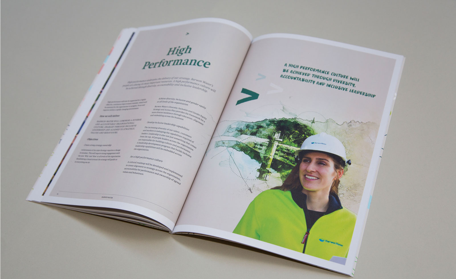
A new visual identity, spanning graphic devices, typefaces, colour palette and image styles were developed to help speak the new language of the brand.
Services
- Brand Strategy
- Brand Development
- Brand Style Guide
- Design
- Collateral Design
- Copywriting
- UI Design
- Web Development
- Photography